
case studies
The Urban Milk Round
Client
The Urban Milk Round
About
Introducing The Urban Milk Round, a London-based milk subscription service revolutionising daily deliveries. Offering doorstep convenience for milk and eggs, they’ve also introduced city-wide vending machines.
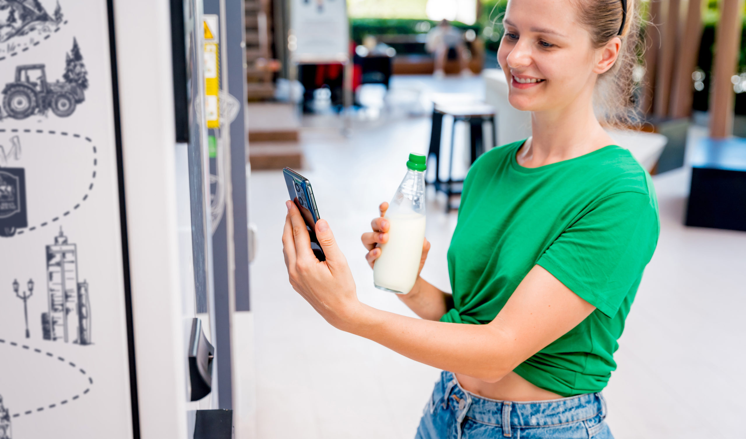
These not only facilitate bottle returns but provide on-the-go access to fresh milk and delightful flavoured shakes like chocolate, strawberry, and banana.
What We’ve Done
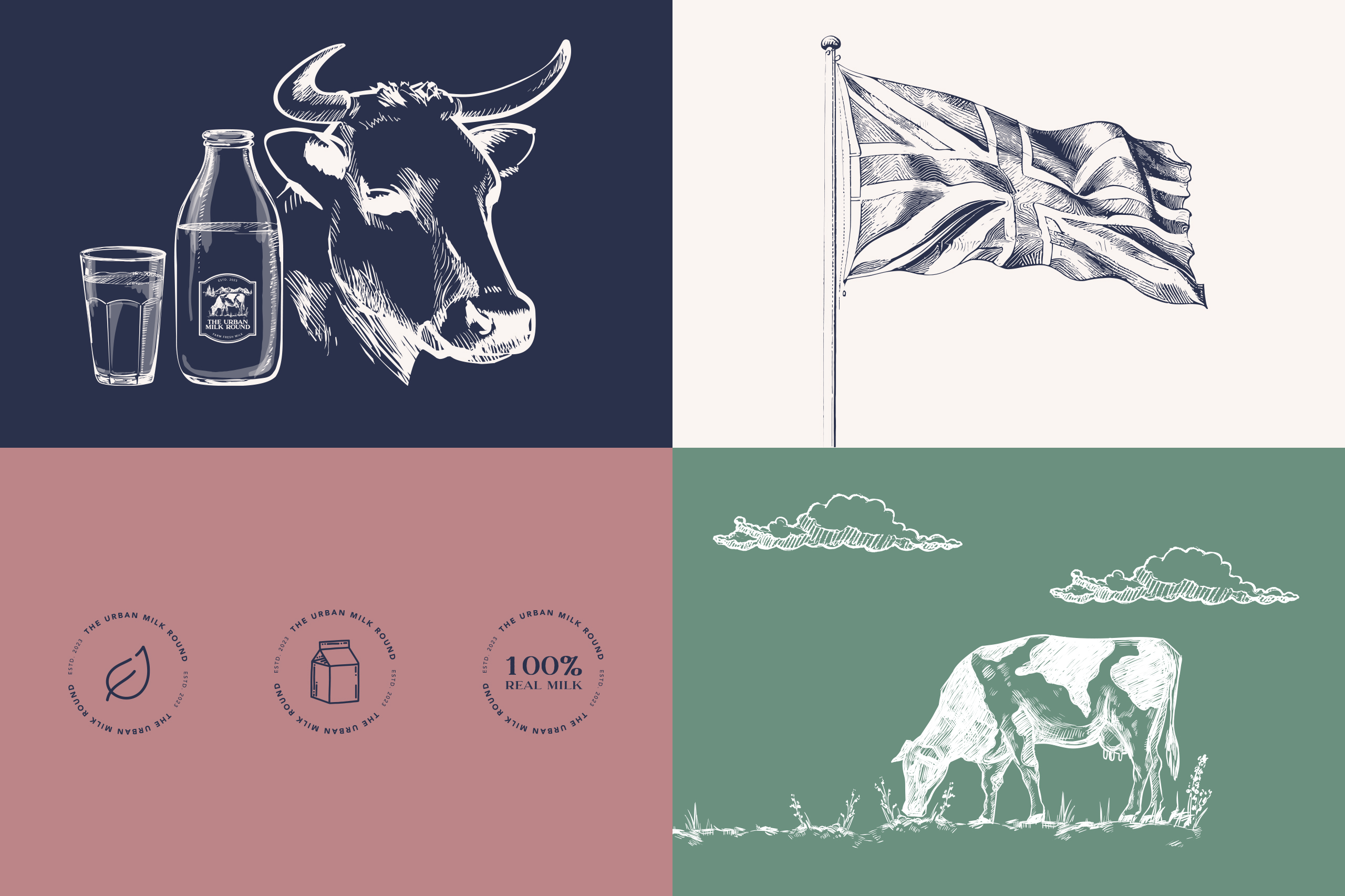
PWF Studio played a pivotal role in shaping The Urban Milk Round’s unique brand. We began by creating a fresh and modern logo, extending this identity to include bespoke illustrations and stylised maps. Our design expertise further translated into eye-catching vending machine wraps, turning them into vibrant urban canvases that stand out.
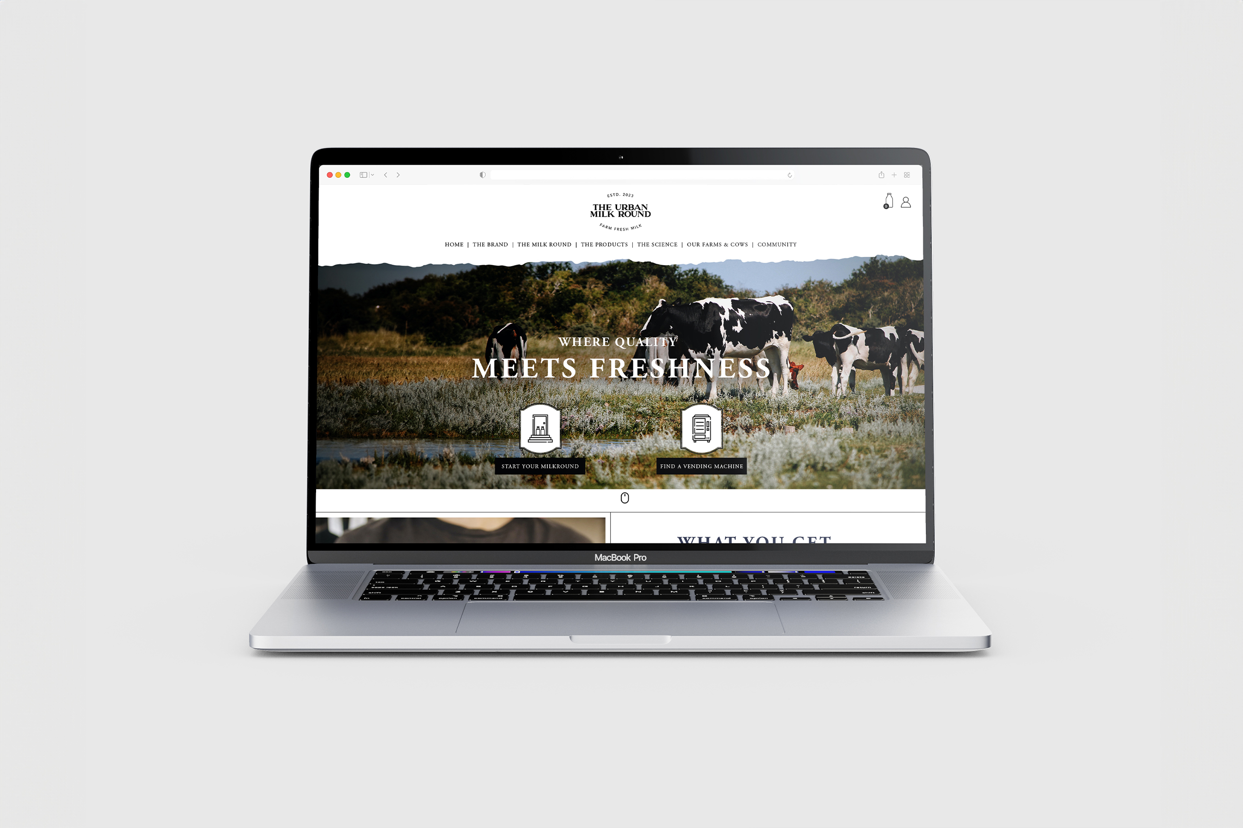
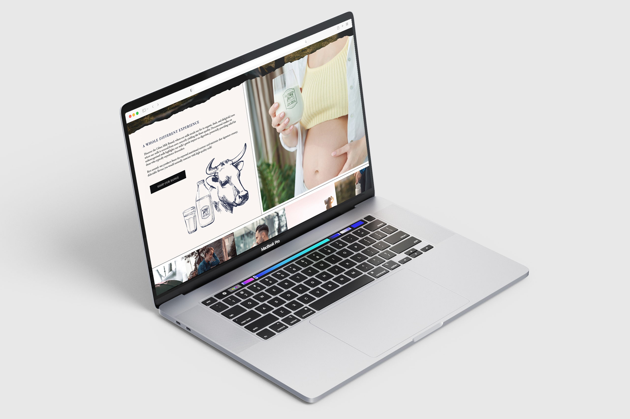
Not stopping there, we brought The Urban Milk Round online with a fully-fledged e-commerce website. This platform not only showcases their offerings but provides a seamless user experience for subscriptions and engagement. PWF Studio’s work ensures that The Urban Milk Round stands out visually and functionally, leaving a lasting impression in the bustling cityscape of London.
Crafting Unique Identities on a Blank Canvas
At PWF Studio, we approach each branding project as a blank canvas, ensuring a bespoke and tailored identity for every client. Our process begins with a deep dive into understanding the essence of the brand, its values, and its unique offerings. This exploration phase allows us to understand insights that serve as the foundation for the creative journey ahead.
With a commitment to originality, we present our clients with a range of identity options, each meticulously crafted to reflect different areas of their brand personality. These options go beyond mere aesthetics; they encapsulate the brand’s story, resonate with its target audience, and align seamlessly with their aspirations.
Our collaborative approach invites clients into the creative process, fostering a sense of ownership and alignment with the final chosen identity. This ensures that the selected brand elements not only visually stand out but also represent the core of the brand.
A Visual Journey from Farm to London
In our collaboration with The Urban Milk Round, PWF Studio introduced a captivating vending machine wrap that goes beyond branding – it tells a story. Central to this design is a stylised illustration map, intricately detailing the journey from farm to the bustling heart of London.
The stylised map not only adds a unique visual dimension but also communicates the brand’s dedication to transparency in sourcing, showcasing the journey of their products from the farm to the doorstep.


Refill and Refresh at Your Fingertips
PWF Studio worked closely with the client to enhance these machines, turning them into versatile stations that cater to the diverse needs of city dwellers.
One standout feature is the ability for passersby to effortlessly refill their empty bottles with fresh milk. This sustainable approach not only reduces waste but also aligns with The Urban Milk Round’s commitment to environmental responsibility. The process is streamlined, making it a quick and easy pit stop for anyone on the move.
But the innovation doesn’t stop there. The vending machines have also been designed to cater to taste preferences with a delightful array of flavoured milkshakes. From classic chocolate to the fruity indulgence of strawberry and banana, the machines offer a refreshing twist to the conventional milkman experience. Users simply select their preferred flavour, adding a touch of personalisation to their dairy experience.

Infusing Warmth and Trust THROUGH ILLUSTRATION
In crafting The Urban Milk Round’s visual identity, PWF Studio recognised the importance of a friendly and approachable aesthetic to establish an immediate connection with the audience. Enter bespoke illustrations – a key element in cultivating a sense of warmth and trust, especially for a brand in its infancy.
Our illustration style was meticulously developed to reflect the brand’s values of freshness, community, and convenience. Each bespoke illustration contributed to a visual language that resonated with the audience, creating an inviting atmosphere and fostering a sense of familiarity.
This unique illustration style became the linchpin of consistency across all collateral. From the website to marketing materials and even the vending machine wraps, the cohesive use of these illustrations wove a narrative that seamlessly integrated with The Urban Milk Round’s brand story.
Beyond aesthetics, the illustrations played a crucial role in humanising the brand. In the context of a new venture like The Urban Milk Round, this approach was instrumental in building trust and establishing an emotional connection with the audience.
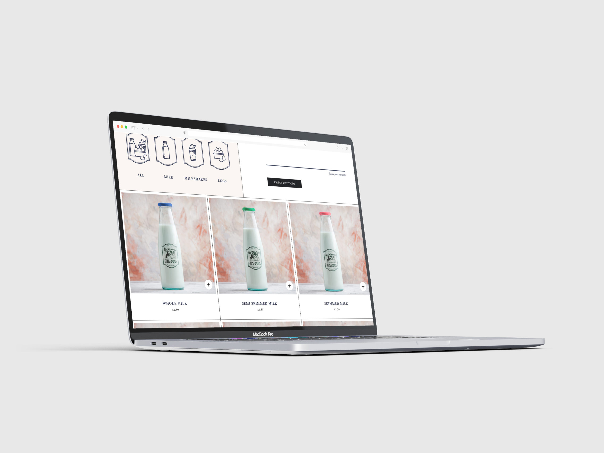
Creating the website
PWF Studio’s collaboration with The Urban Milk Round extended to creating a website from the ground up. Our goal was clear – to seamlessly integrate the brand’s identity into a user-friendly online space that reflected its values of freshness, convenience, and community.
The website became a digital showcase of The Urban Milk Round’s story, leveraging bespoke illustrations, stylised maps, and the overall brand aesthetic to create a visually cohesive and engaging user experience. Consistency was paramount, and every element, from colour schemes to font choices, echoed the warmth and friendliness associated with the brand.
A standout feature we introduced was the “Find a Local Vending Machine” pop-up. Leveraging individual locations. This innovative feature personalised the user experience, providing real-time information on the nearest vending machines. This not only enhanced user convenience but also reinforced the brand’s commitment to being a local, accessible service.

A subscription based hub
The website acted as the central hub for subscription services, product exploration, and brand engagement. Its intuitive design and integration of elements ensured that visitors experienced the brand authentically and consistently across every digital interaction.
PWF Studio’s contribution to The Urban Milk Round’s website was more than just a digital presence – it was a dynamic and cohesive extension of the brand, delivering a user experience that mirrored the freshness and modernity of their doorstep deliveries and innovative vending machines.

projects to check out
projects to check out
projects to check out
projects to check out
