
Client
Leaf Psychology
About
Leaf Psychology is a Newark-based psychology practice offering a fresh, compassionate, and deeply personal approach to mental wellness. As a newly established startup, Leaf was built with a vision to create a safe, nurturing space where clients feel seen, supported, and empowered on their journey to growth and healing.
What We’ve Done
Leaf Psychology came to PWF Studio with a blank canvas and a bold vision. They needed more than just a logo – They needed a full brand identity that felt authentic to the founder, resonated with clients, and reflected the values at the heart of the business.
We partnered closely with the founder to deeply understand not only their personal ethos but the emotional and professional landscape of psychology itself. From these early conversations, we crafted a brand that reflects care, clarity, and calm – A true extension of both the business and the individual behind it.
Our work included a full brand suite: initial visual concepts, colour variants, strapline development, supporting brand elements, bespoke icons, printed collateral, and thoughtful promotional items. Every detail was considered, every decision intentional.

Where Identity Takes Root
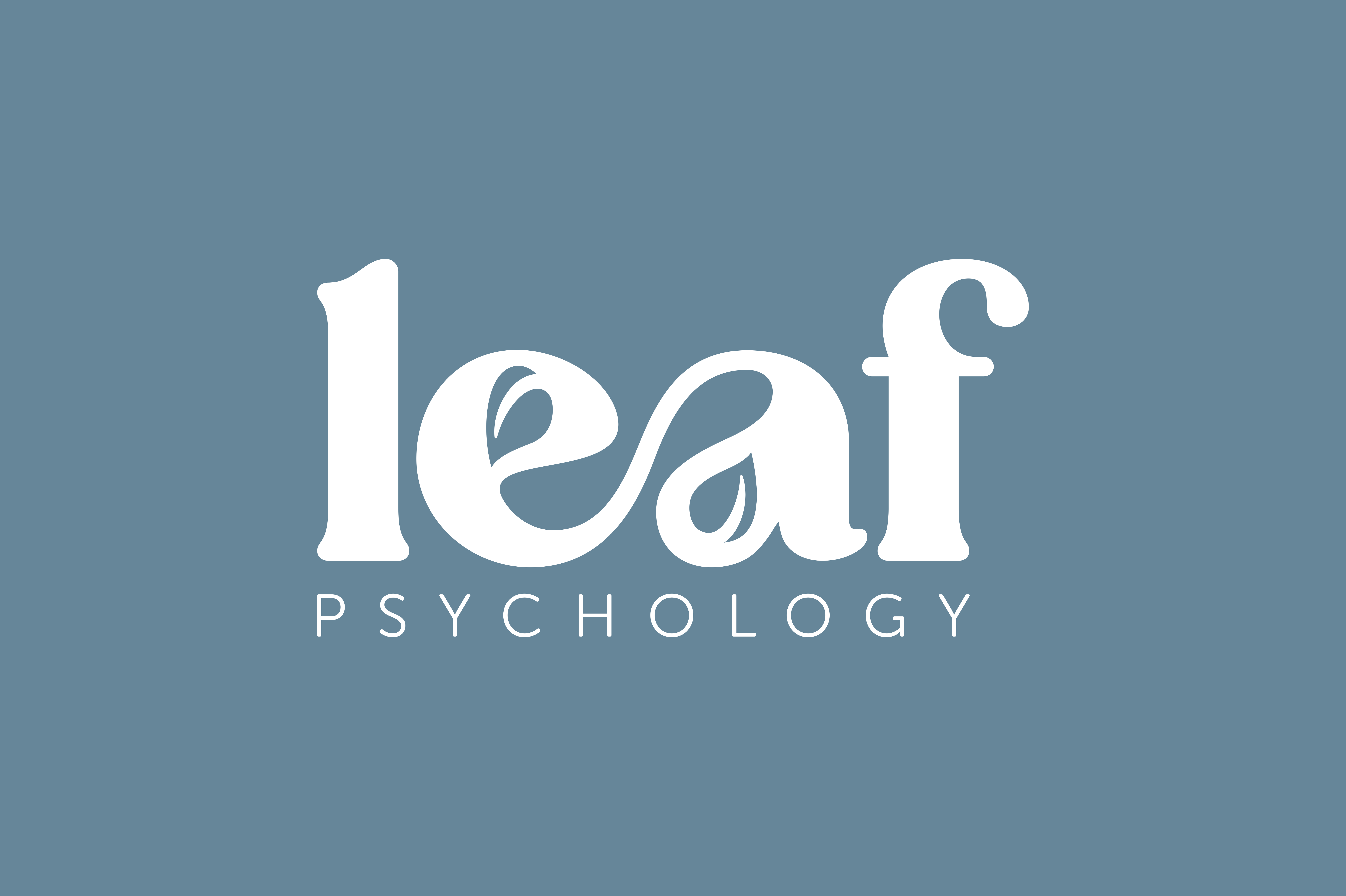
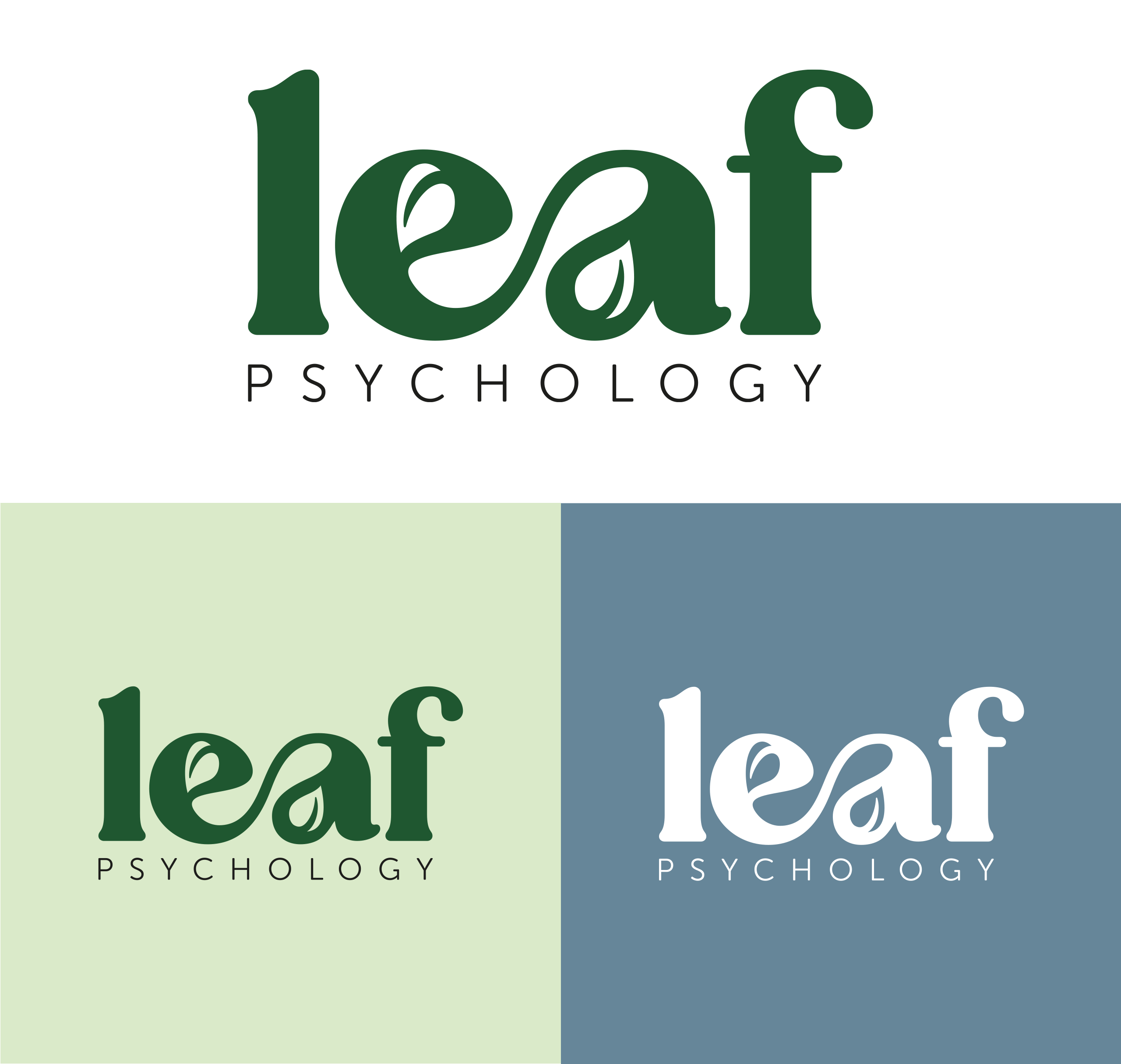
For Leaf Psychology, we created a bespoke typographic logo that’s both elegant and meaningful. Subtle leaf shapes live within the counters of the ‘e’ and the ‘a’ – Visual nods to the natural growth that psychology can nurture. These two letters also intertwine gently, symbolising guidance, trust, and the supportive journey between psychologist and client. The result is a wordmark that is distinctive, personal, and rich in metaphor – An identity with emotional intelligence.
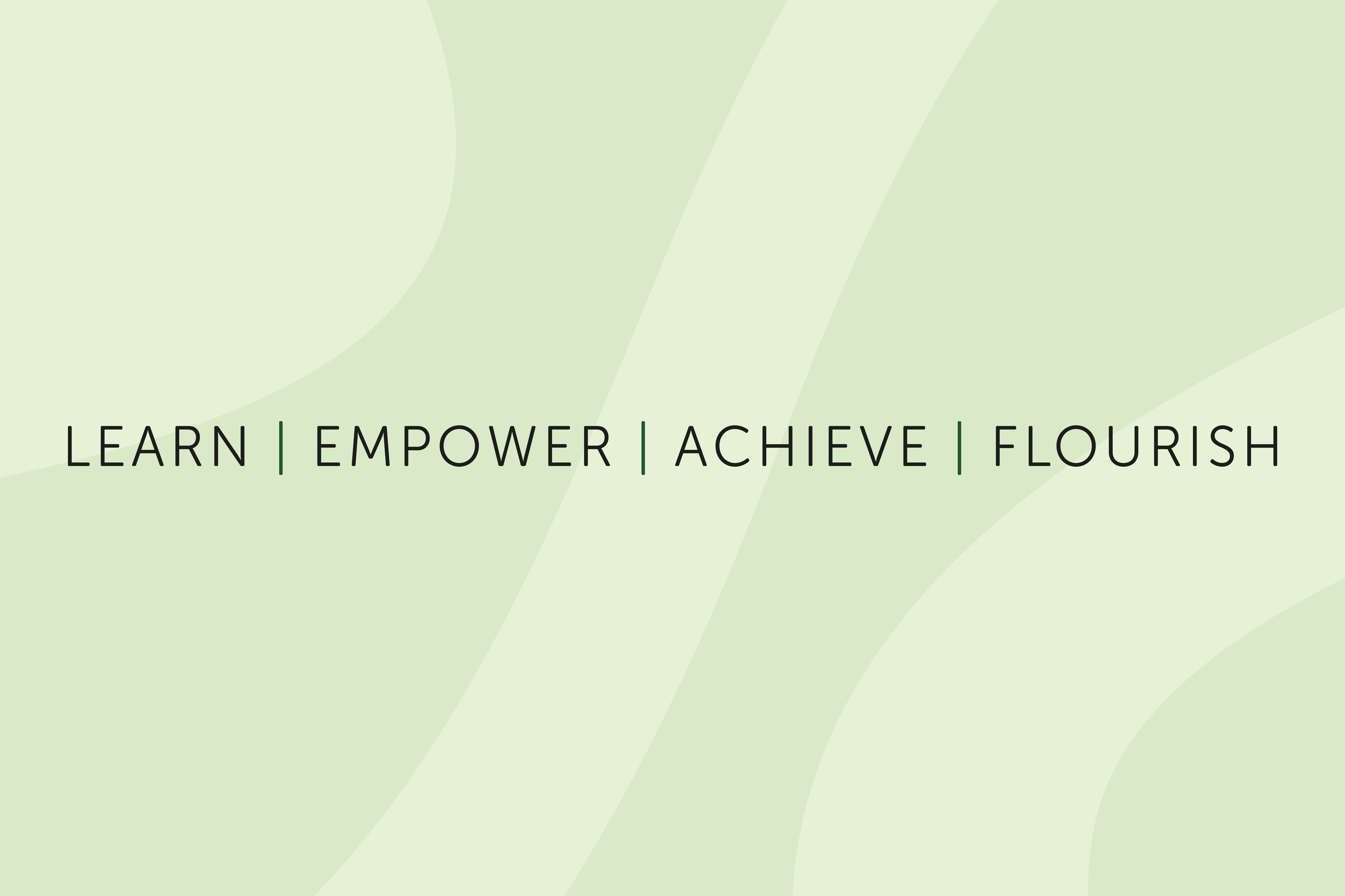
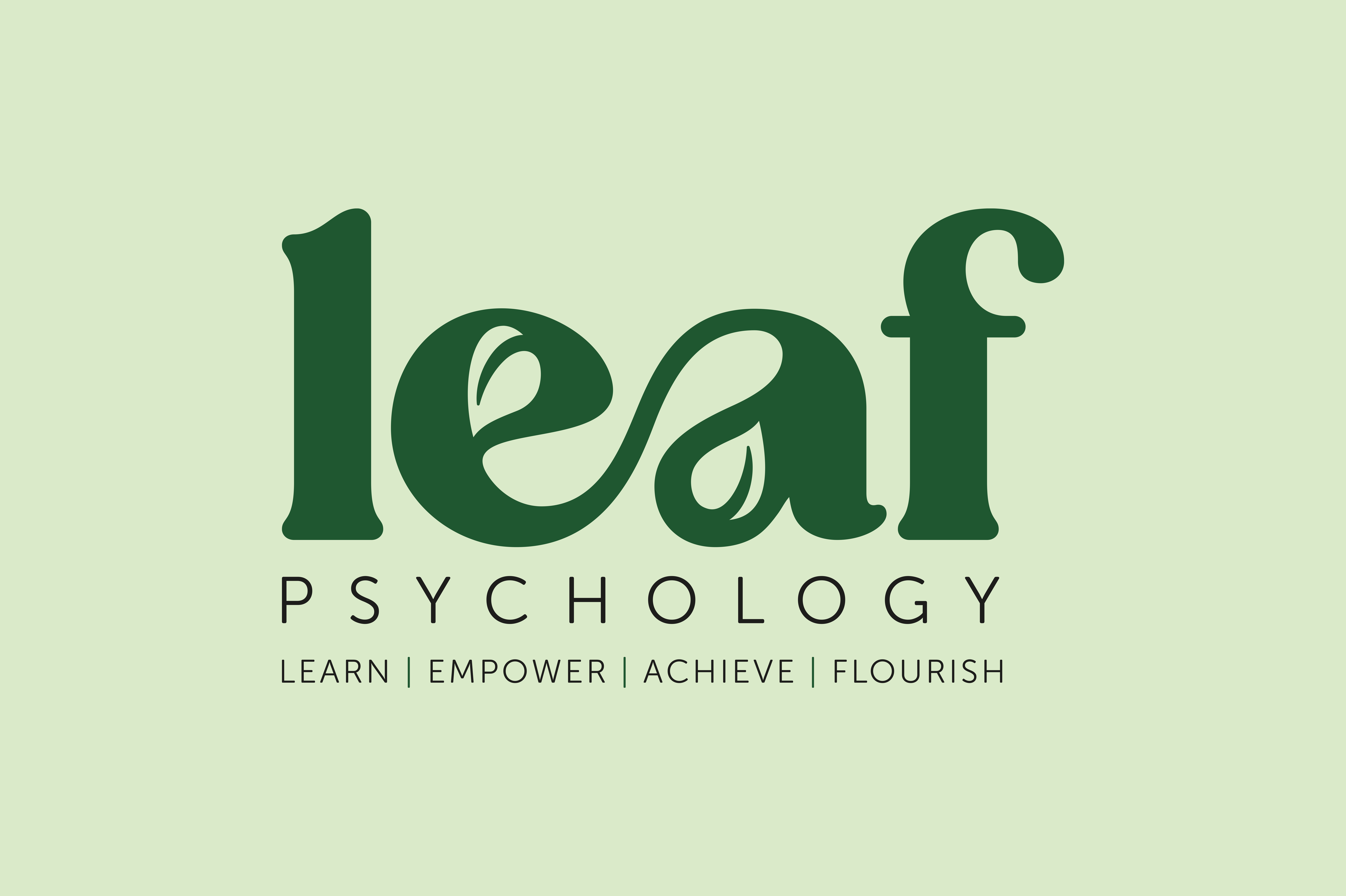
Learn. Empower. Achieve. Flourish.
The strapline wasn’t just a tagline – It was a journey in itself. We wanted to create something that captured the entire spirit of Leaf Psychology in four simple but powerful words.
Together with the founder, we workshopped and explored acronym-based options that could truly embody their mission. The final result – Learn. Empower. Achieve. Flourish. – does exactly that. It speaks to both the psychological process and the personal transformation Leaf’s clients experience.
Each word in the acronym is supported by bespoke iconography and a unique colour palette. This modular design approach gives the brand flexibility while anchoring it in meaning – Whether we’re talking about ‘Empower’ in a blog post or creating materials for a ‘Flourish’ workshop, the visuals shift and adapt while staying true to the core brand.
Pattern with Purpose
To extend the brand visually, we created a bespoke pattern inspired by the logo’s forms and principles. It acts as a cross-section of the brand – intricate, organic, and grounding.
This pattern adds visual interest and emotional resonance across social content, print, and décor. We paired it with calming colour palettes and inspirational messages like “Where every thought takes root” and “Start small, flourish big.” These act as gentle affirmations for Leaf’s audience – Subtle cues that growth is always possible, even in quiet ways.

A Cup of Comfort
We designed branded mugs for both the founder and her clients – Not just as merchandise, but as part of the therapeutic experience.
Warm drinks have a unique ability to soothe, settle, and open us up. There’s something about a cup of tea or coffee that feels like a small, quiet hug – A familiar comfort that helps people feel safe enough to talk, to share, to begin. These mugs were created with that moment in mind, offering a tangible piece of the Leaf brand that supports every conversation.

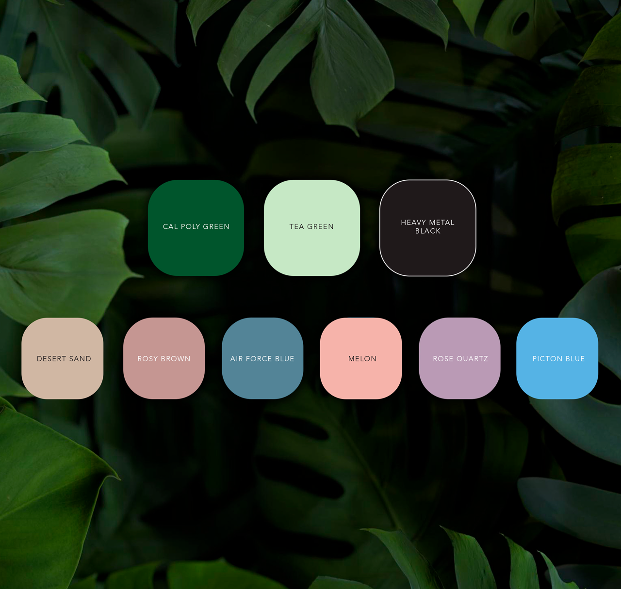
Colour with Compassion
We developed an extensive colour palette for Leaf Psychology that reflects the brand’s gentle, uplifting nature. The palette includes a serene primary set and a broader secondary range, giving the brand flexibility without ever feeling disjointed.
By avoiding a restrictive approach, we’ve given Leaf the tools to grow – To evolve their materials and messaging while always staying rooted in their core aesthetic. Whether it’s used in digital, print, or interior space, the palette keeps the brand feeling fresh, human, and alive.
projects to check out
projects to check out
projects to check out
projects to check out
projects to check out

BlueSky Education
BlueSky Education
BlueSky Education
- Branding
- Large Format
- Website
Newton Fallowell
Newton Fallowell
Newton Fallowell
- Animation
- Campaigns
- Large Format
Belvoir Sales Campaign
Belvoir Sales Campaign
Belvoir Sales Campaign
- Animation
- Campaigns
- Large Format
FeRFA
FeRFA
FeRFA
- Animation
- Branding
- Website