case studies
The Protection Revolution
Client
The Protection Revolution
About
The Protection Revolution is on a mission to shake up the financial advice industry by putting life insurance and protection products front and centre.
Through in-person sales skills training programmes, they empower advisers to deliver advice that’s truly holistic, aligned with Consumer Duty standards, and confident in placing protection at the heart of every financial conversation.
What We’ve Done
We worked closely with The Protection Revolution to craft a bold and versatile brand identity that captures their mission and values. From concept to completion, we explored multiple design options to ensure their new look was as revolutionary as their vision. The final identity package included a striking emblem, flexible logo lockups, dynamic secondary design elements, and a thoughtfully curated colour palette. Oh, and we didn’t stop there – our designs found their way onto everything from banners and notebooks to professional ties, ensuring the brand is dressed for success across the board.
How We Kick Off Every Branding Project
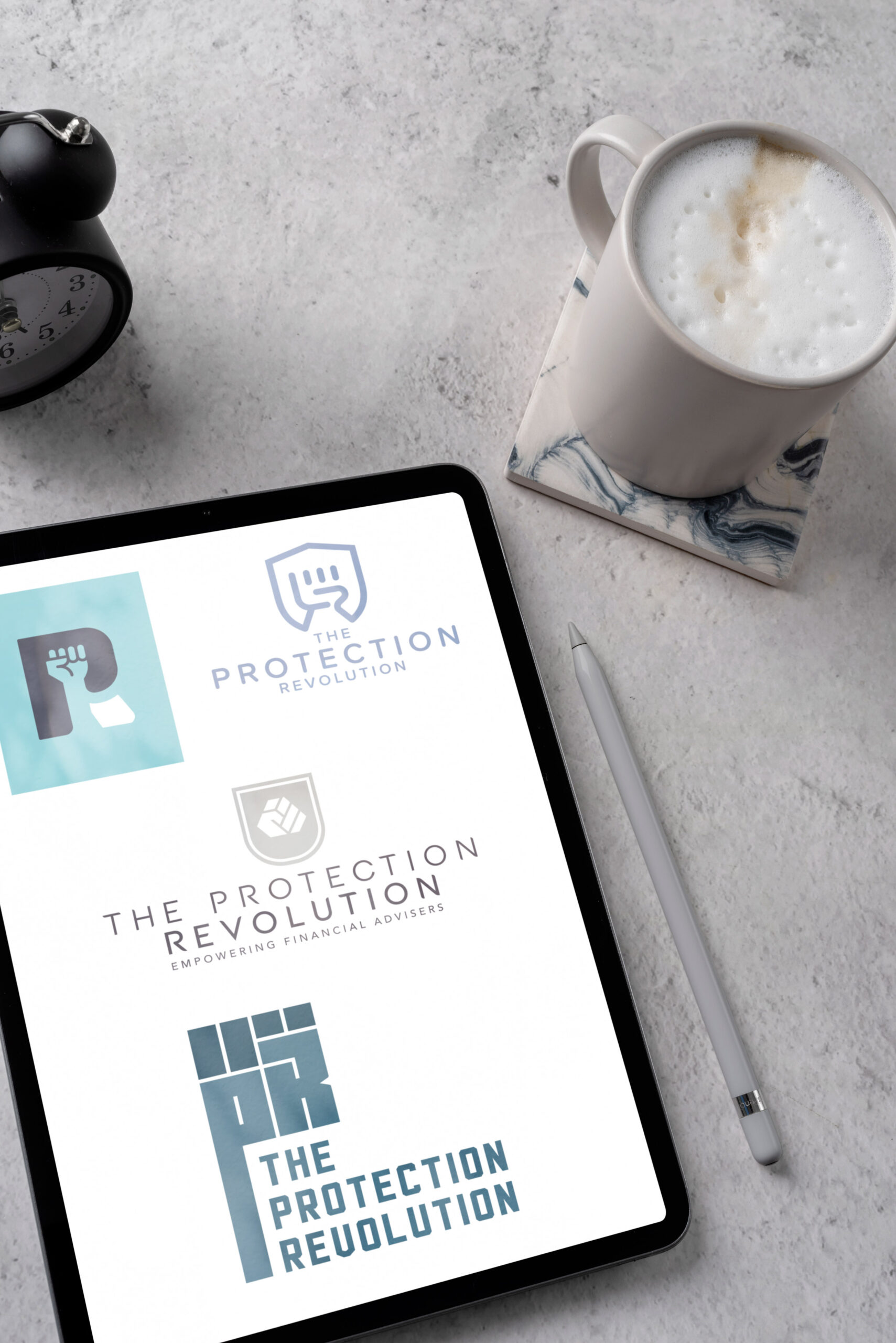
At PWF Studio, we know branding is not one-size-fits-all. That’s why we always start by exploring multiple creative routes, giving our clients options to find the one that fits like a glove. For The Protection Revolution, this meant crafting several initial identity concepts that blended boldness with professionalism.
Once the client chose their favourite, we rolled up our sleeves and refined the design based on their feedback.
The result? A brand that doesn’t just look the part but embodies everything they stand for. By collaborating every step of the way, we ensured their identity was as unique as their mission to transform financial advice.
Designed to Work Anywhere
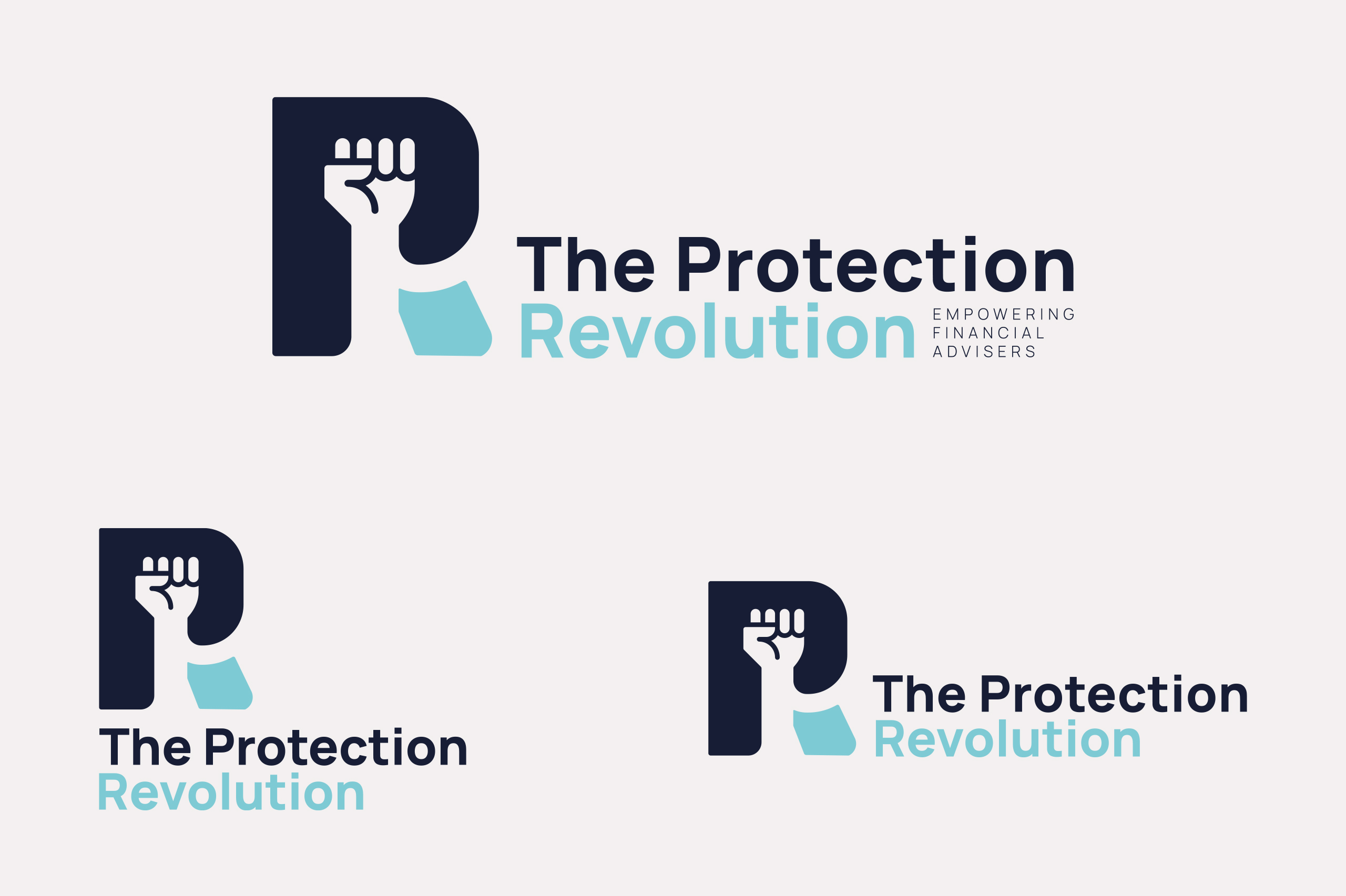
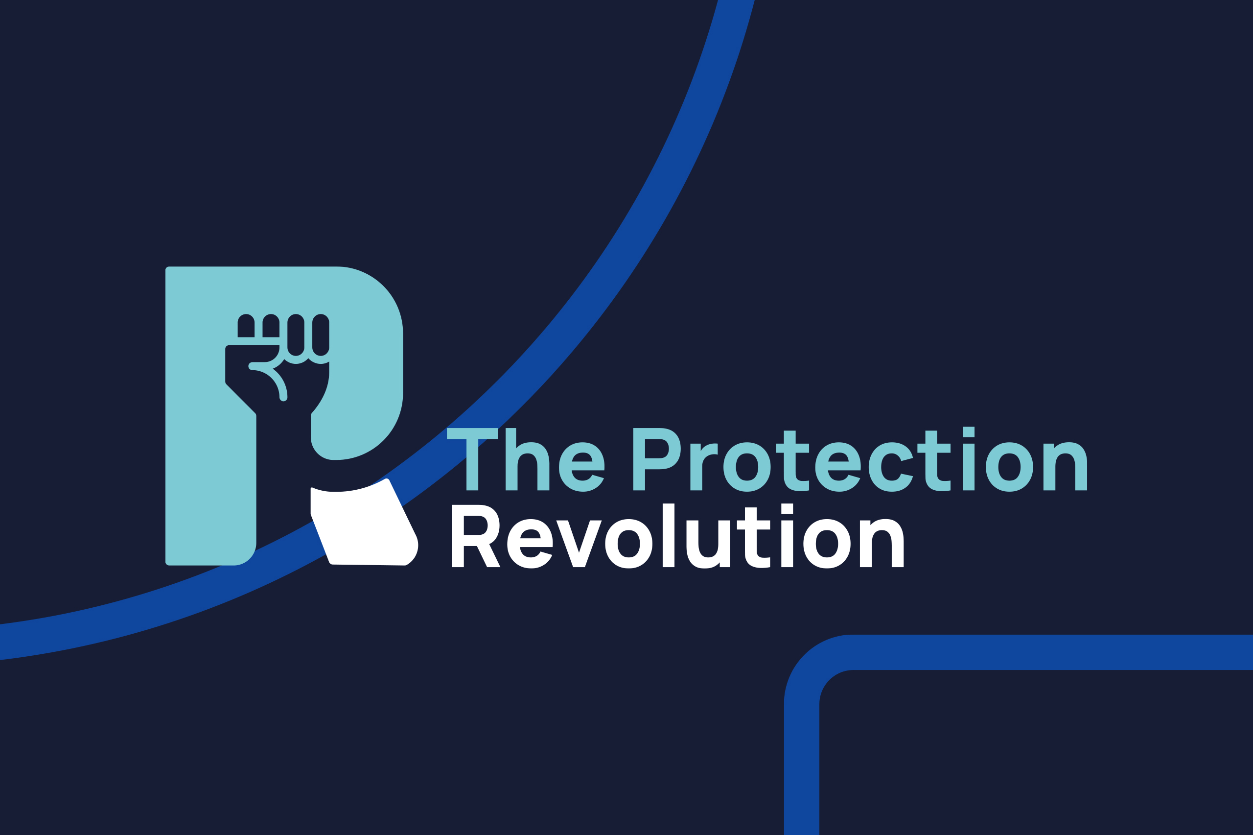
A great brand doesn’t just look good – It’s practical too. For The Protection Revolution, we created a suite of logo lockups tailored for every scenario. Need something sleek for an email signature? Done. Want a bold stacked version for a business card? Got it.
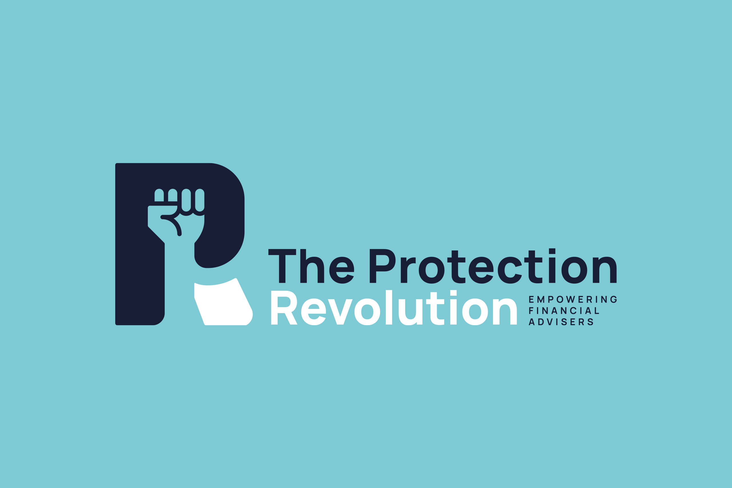
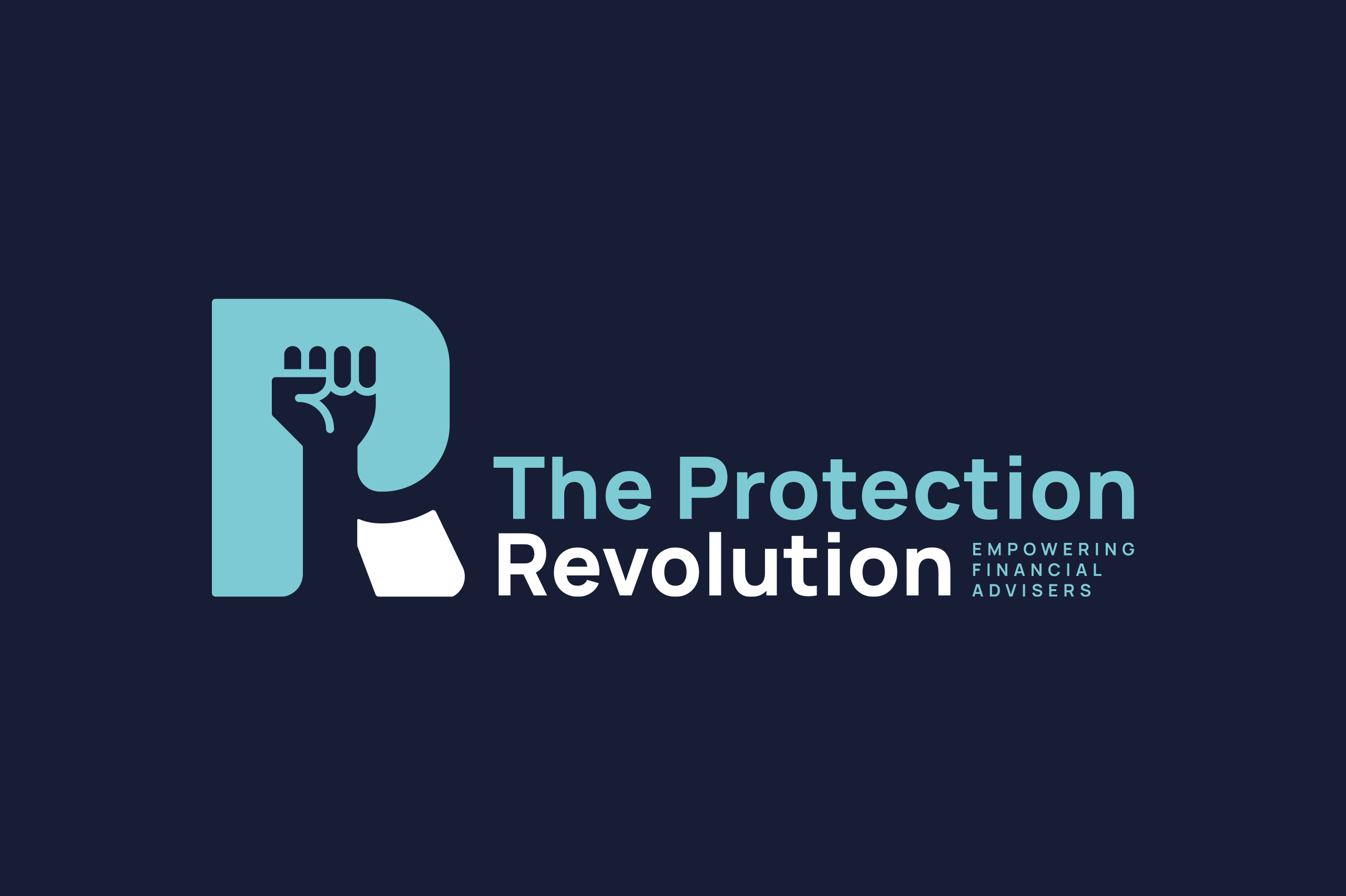
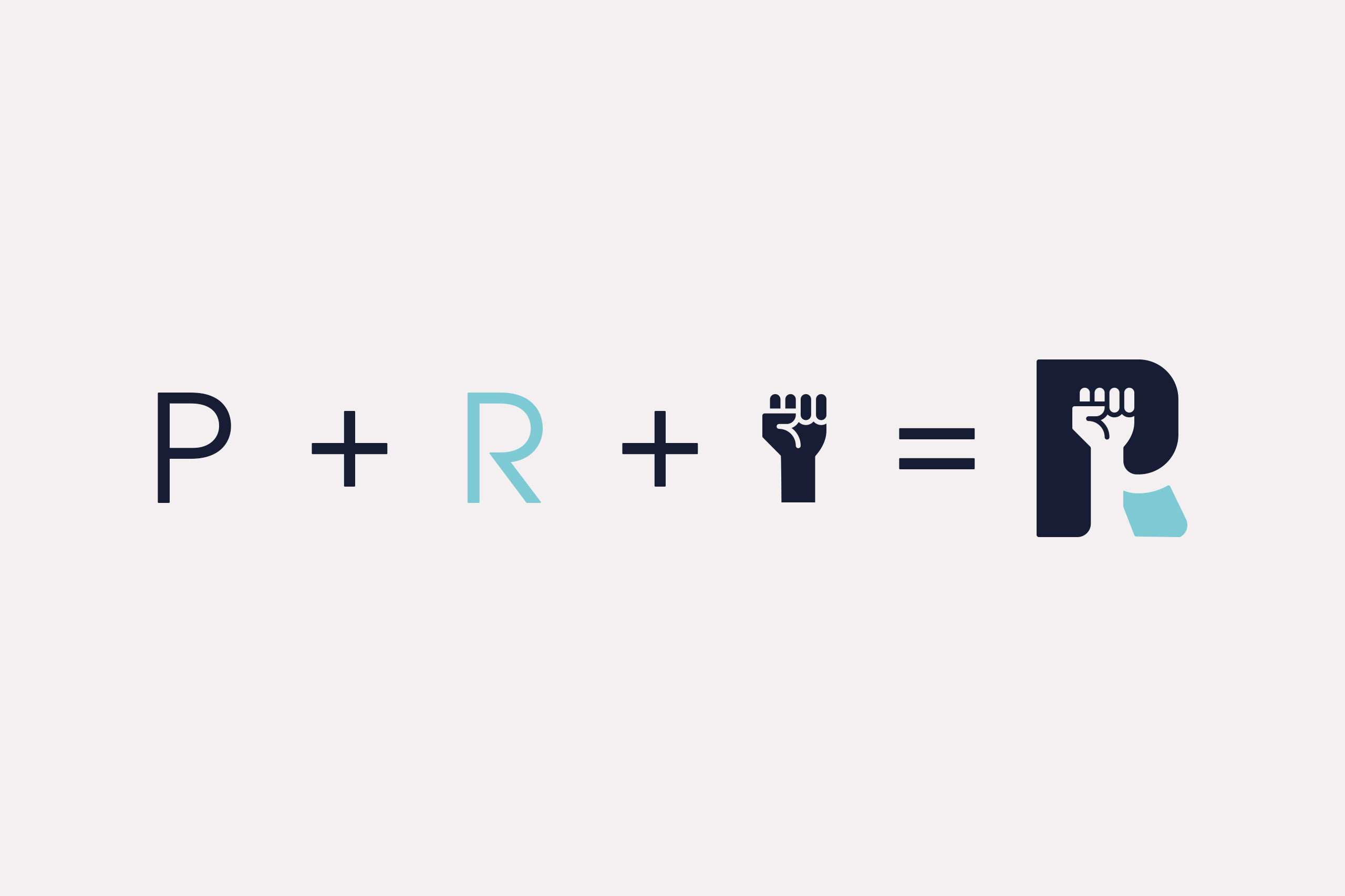
At the heart of it all is their bespoke emblem, a clever combination of the “P” from Protection, the “R” from Revolution, and a subtle fist in the white space – A nod to their mission to lead a movement. This emblem is more than just a logo; it’s a statement, ready to stand on its own as the brand grows and gains recognition.



Lines With Meaning – Bringing the Revolution to Life
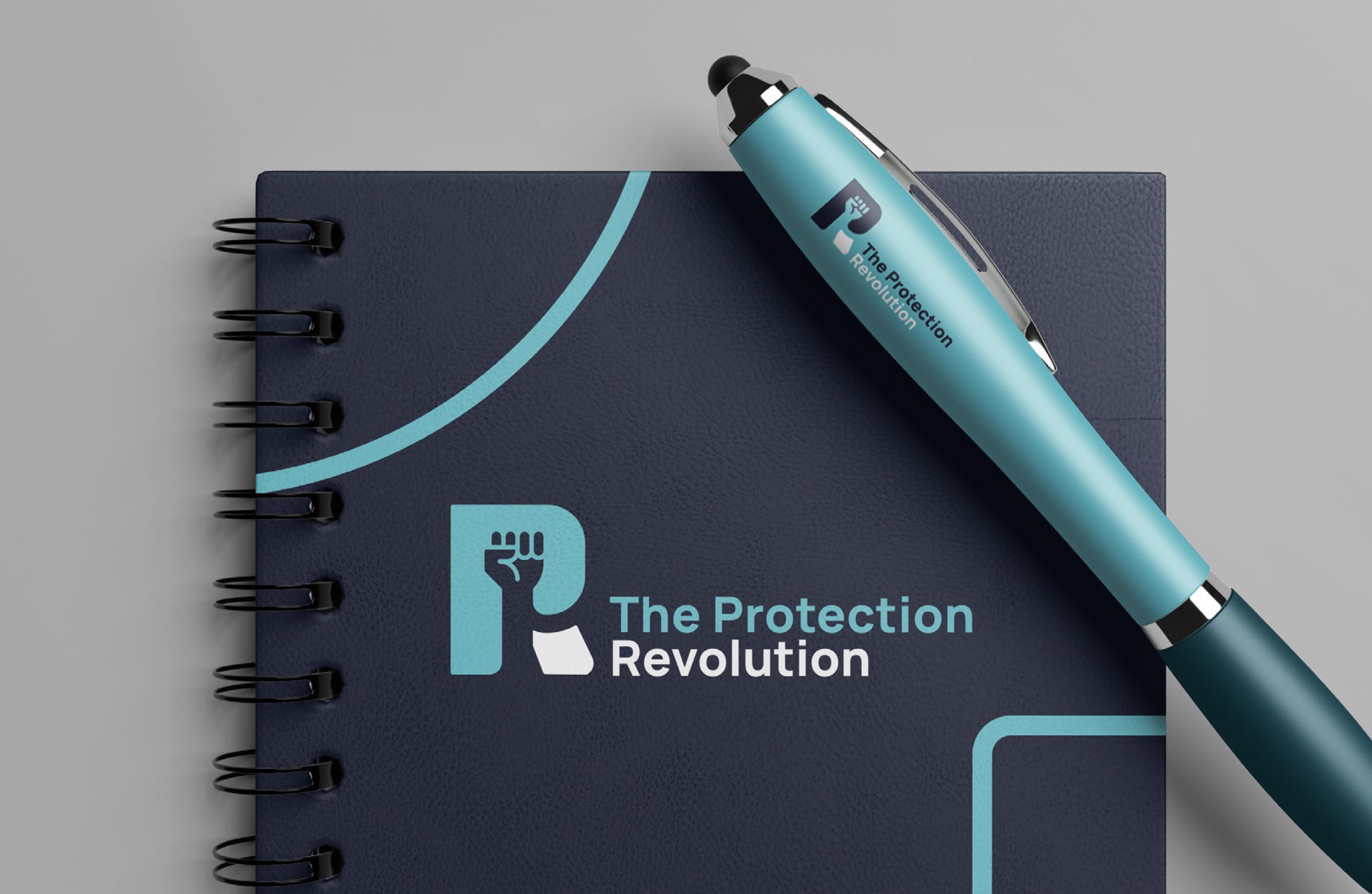
To give the brand extra personality, we developed a secondary design element inspired by the emblem’s contours. These flowing stroke lines represent the journey The Protection Revolution takes its clients on – A visual metaphor for progress, growth, and guidance.
These strokes made their way onto pull-up banners for conferences, notebooks for training sessions, and even seminar presentations, tying every element of the brand together. We even extended the look to custom-branded ties, bringing a touch of flair and professionalism to their team’s event attire. Who says finance can’t have a little style?

A Palette for Every Purpose
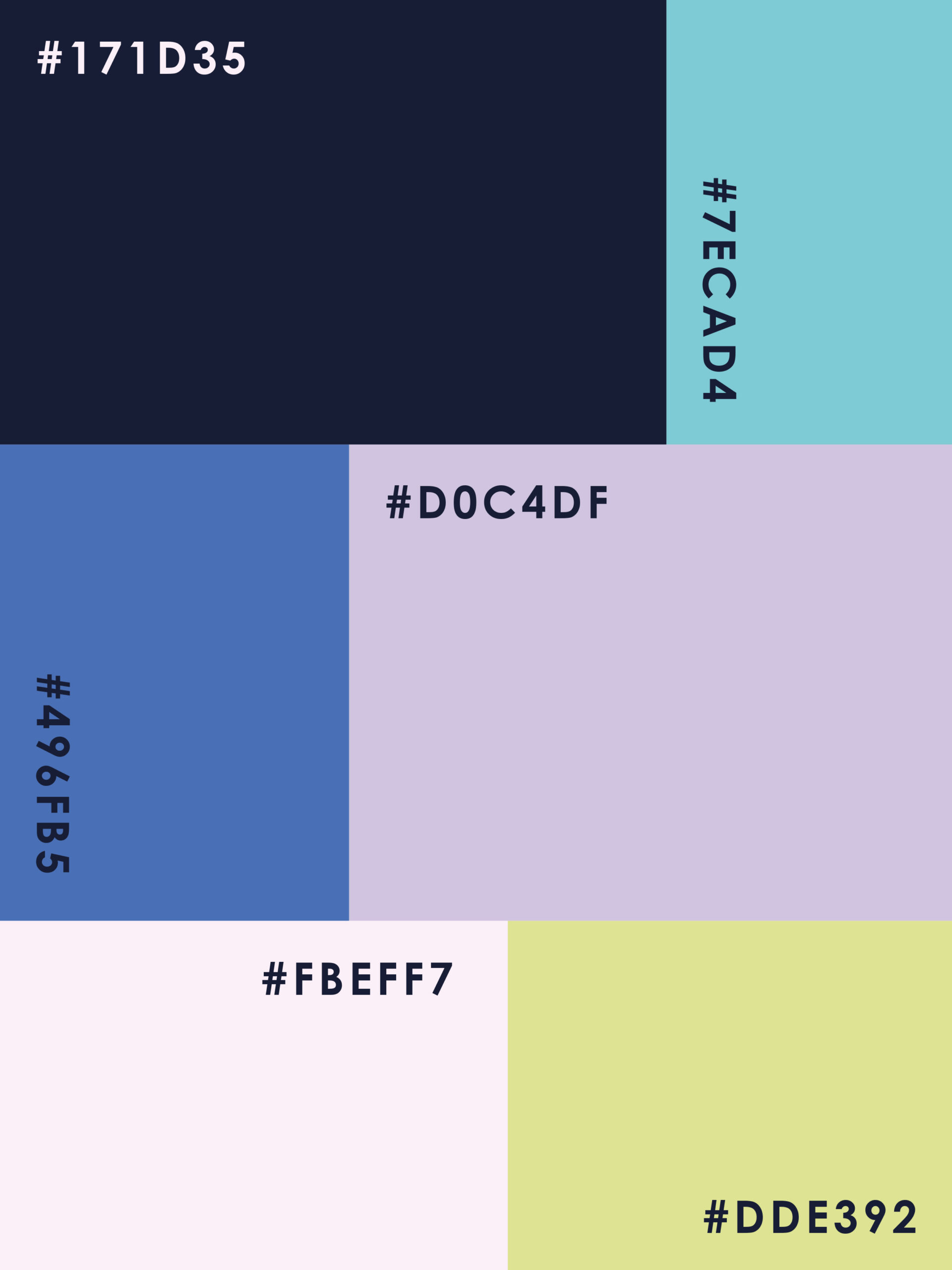
A brand’s colours are its personality, and for The Protection Revolution, we created a palette that’s as versatile as it is vibrant. The primary colours were chosen to convey trust, energy, and professionalism—key qualities for their industry—while the secondary palette added complementary shades for flexibility.
Whether it’s a conference banner, a training presentation, or an email signature, the palette ensures the brand always looks cohesive, polished, and ready to stand out.
Through collaboration, creativity, and a touch of revolution, we helped The Protection Revolution step into their new identity with confidence. With a bold look that works across every platform, they’re ready to lead the charge in reshaping financial advice.
projects to check out

projects to check out

projects to check out

projects to check out


