
case studies
Three Sixty Physio
Client
Three Sixty Physio
About
Three Sixty Physio is a modern, patient-focused physiotherapy clinic dedicated to helping individuals move better, recover faster, and perform at their best.
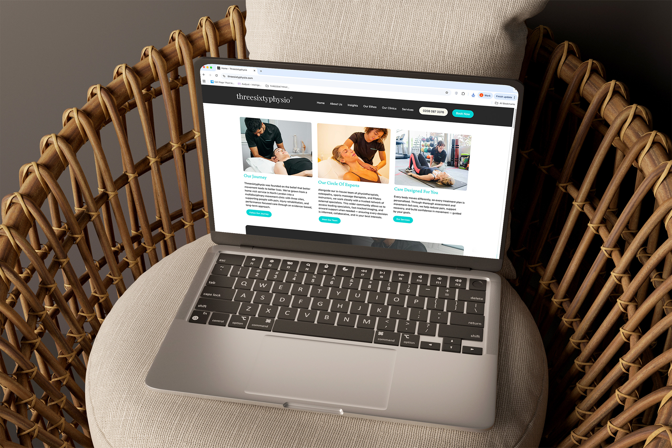
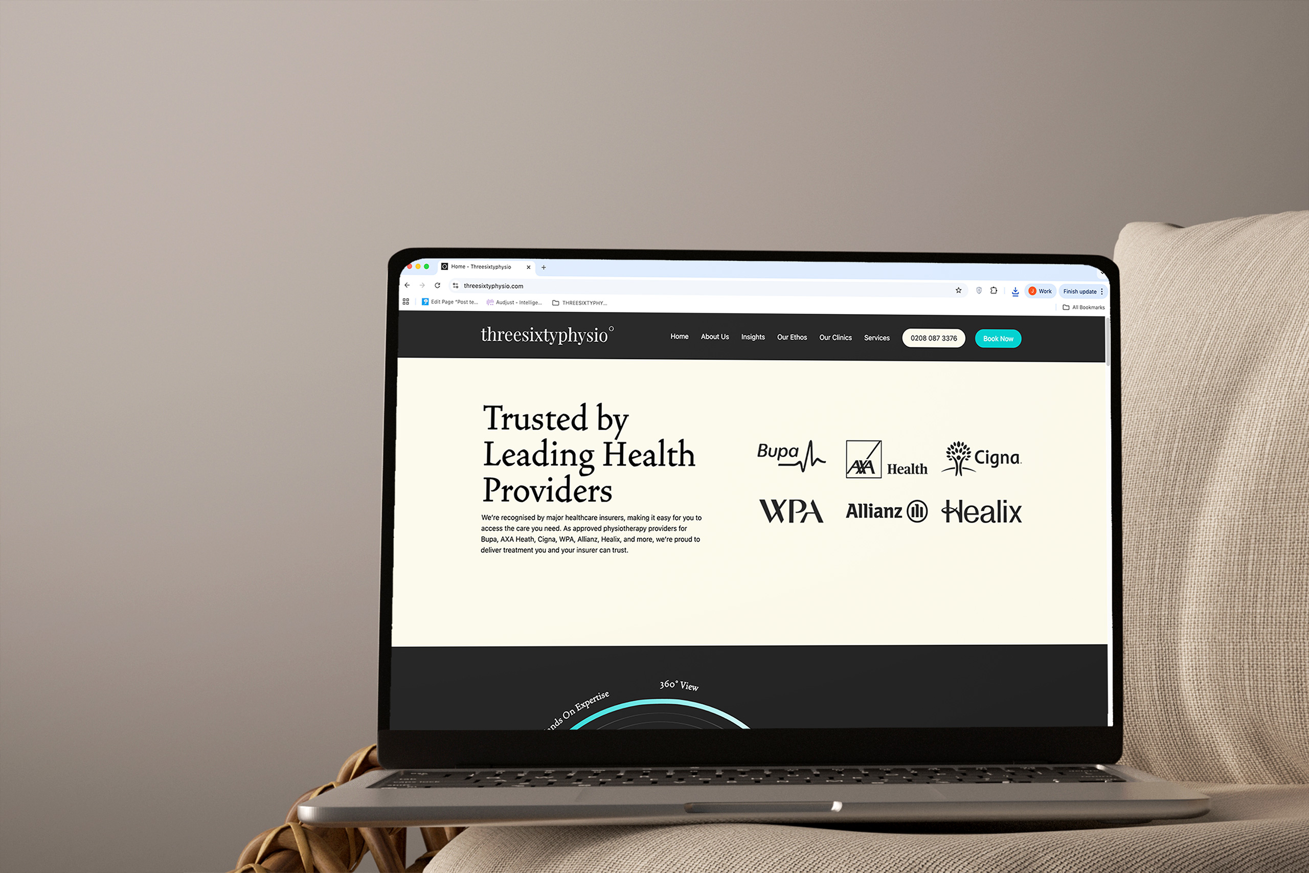
Founded on a commitment to delivering high-quality, evidence-based treatment, Three Sixty Physio works with a diverse client base – From individuals managing everyday aches and pains to athletes striving for peak performance. Their experienced team addresses not just symptoms but the root cause of injury, helping clients build strength, resilience, and long-term confidence in their movement.
What We’ve Done
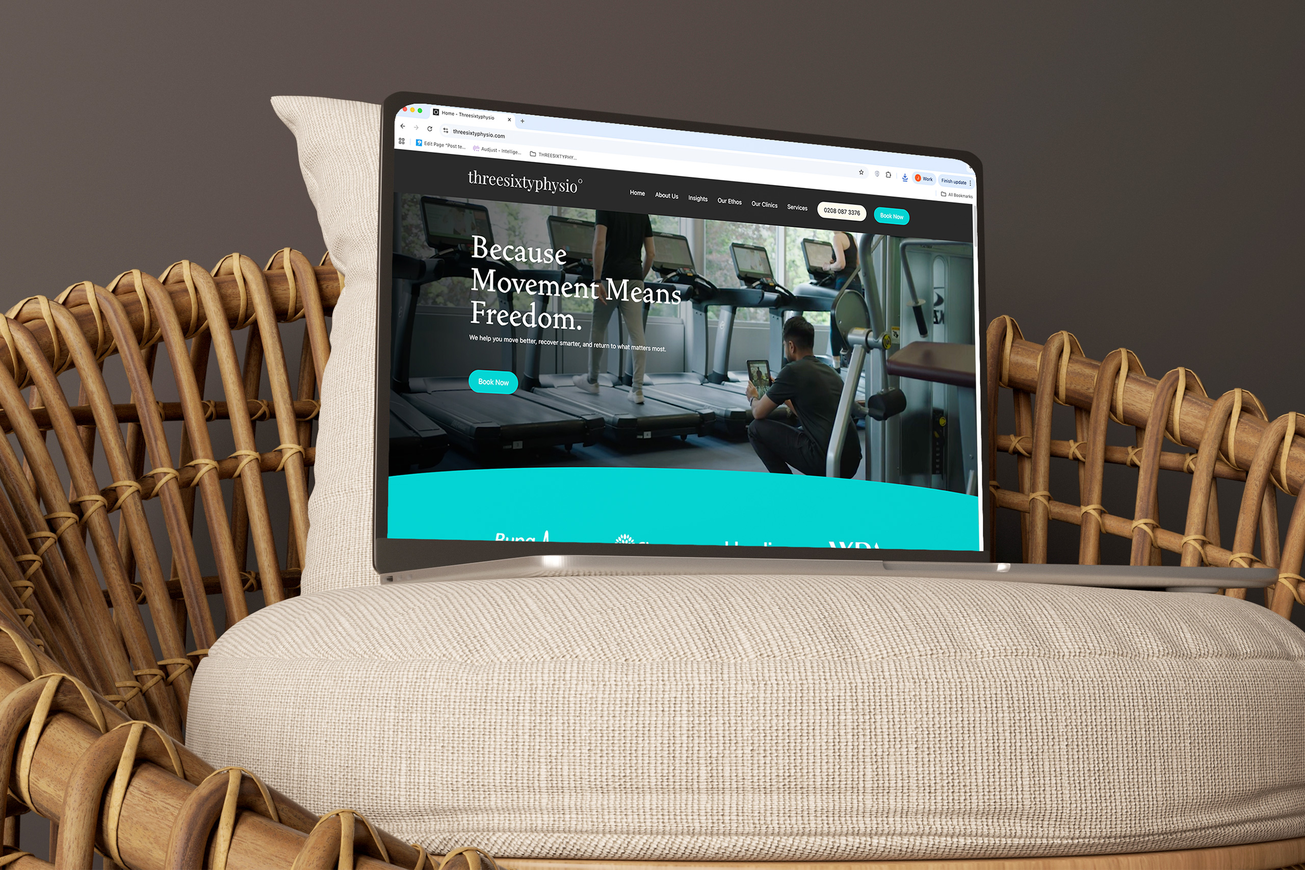
We approached the project with a focus on creating a modern, engaging digital experience that reflects the quality of care and expertise behind Three Sixty Physio. We designed and built a fully bespoke website, tailored to their brand and audience, with clear user journeys that make it easy for visitors to explore services, understand treatments, and take the next step in their recovery.
The site incorporates interactive elements and content to create a more engaging experience, helping to communicate their approach in a way that feels both professional and accessible. From streamlined navigation to mobile-first performance, every detail was considered to ensure the website not only looks the part but functions seamlessly.
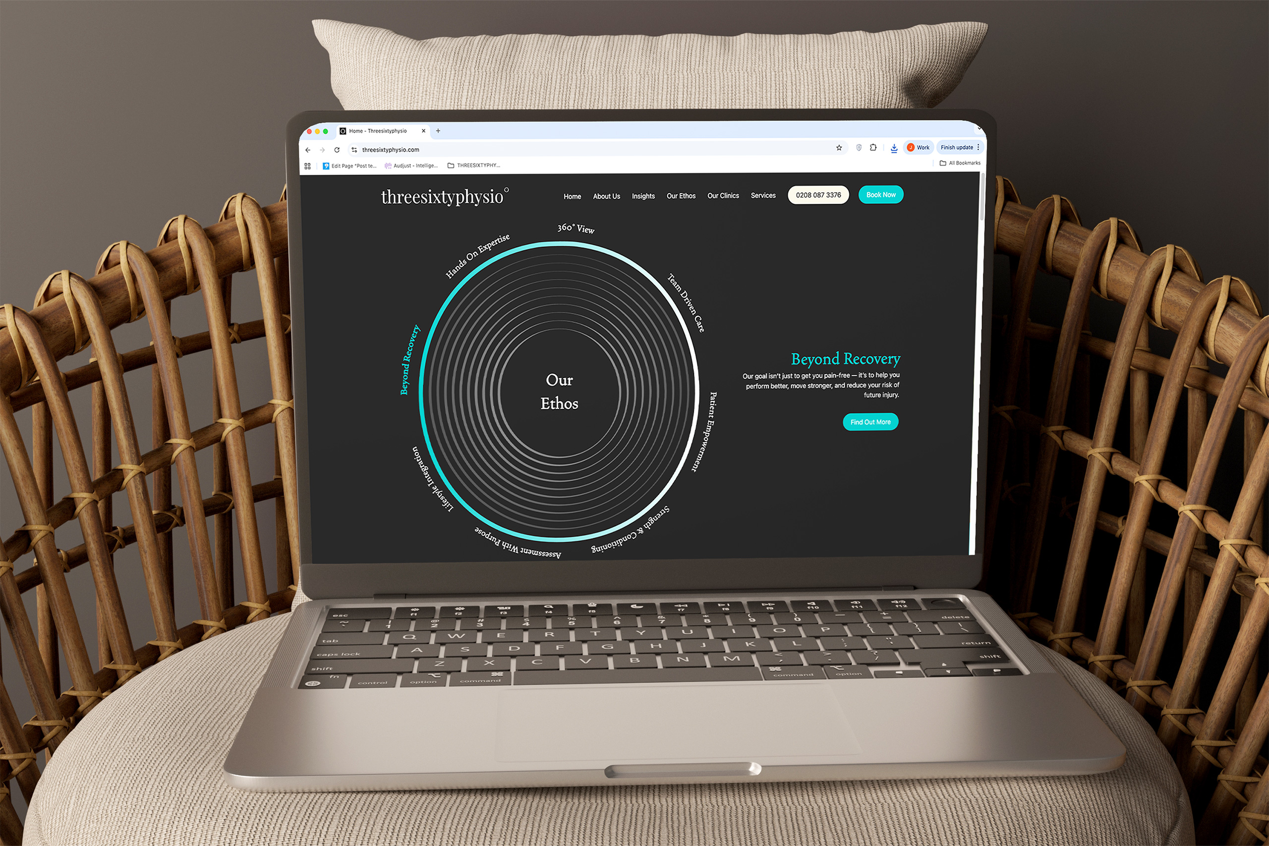
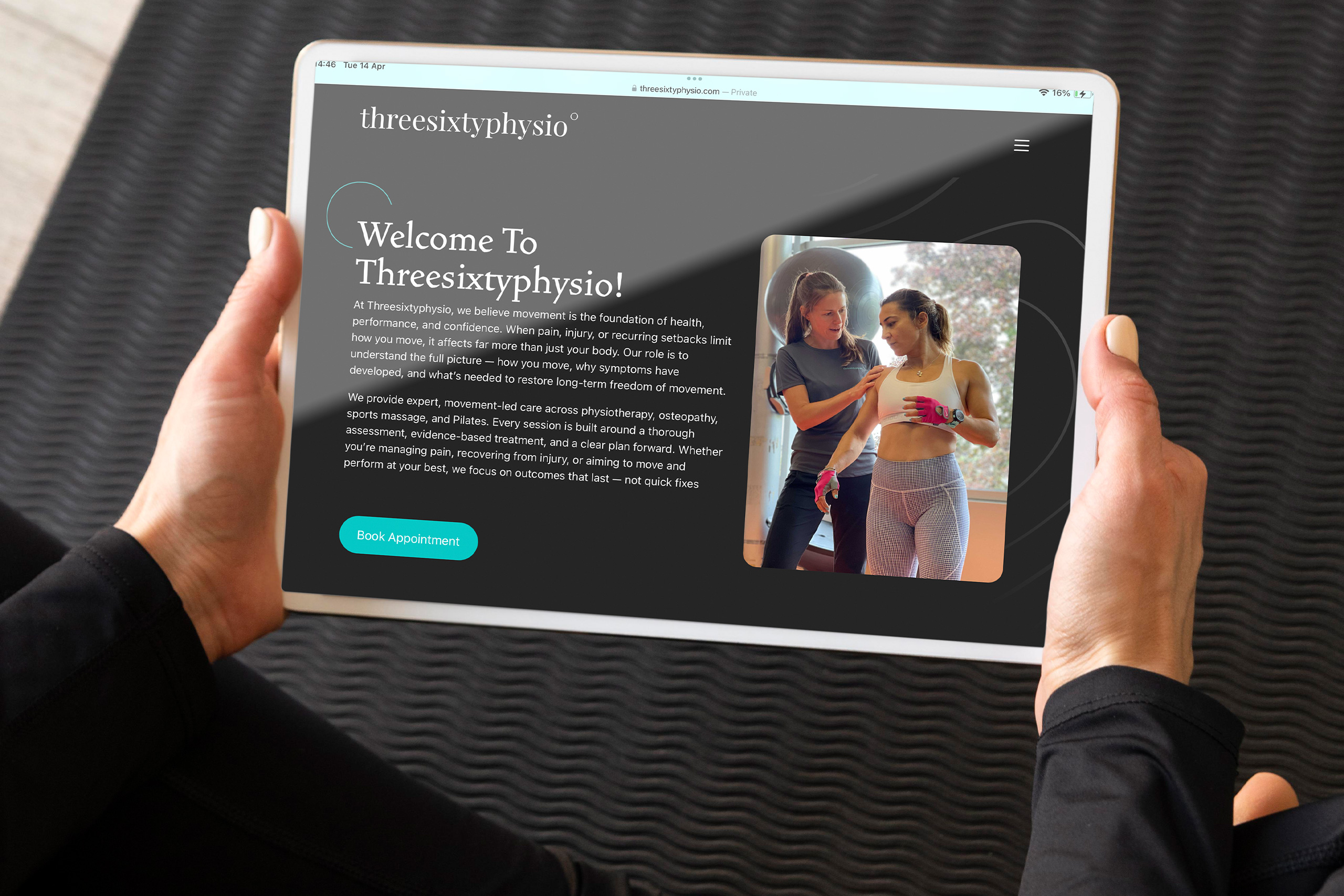
Bringing the 360 Approach to Life
At the heart of the website sits the “Our Ethos 360” ring – An interactive feature designed to visually represent the core principles that underpin everything Three Sixty Physio does. Rather than presenting this as static content, we transformed it into a dynamic, engaging element that invites users to explore each pillar in a more intuitive way.
The fully interactive ring allows users to click on each segment to reveal deeper insights into the clinic’s approach, without overwhelming them with too much information upfront. You can dip in and out, explore at your own pace, and build up a picture of how everything connects.
From a design and build perspective, it’s a small detail that carries a lot of weight. The interaction adds a level of depth to the experience, while the clean, considered execution keeps it feeling effortless. It’s a simple idea, done properly – And it helps set the tone for the rest of the site.
Designed to Explore, Built to Engage
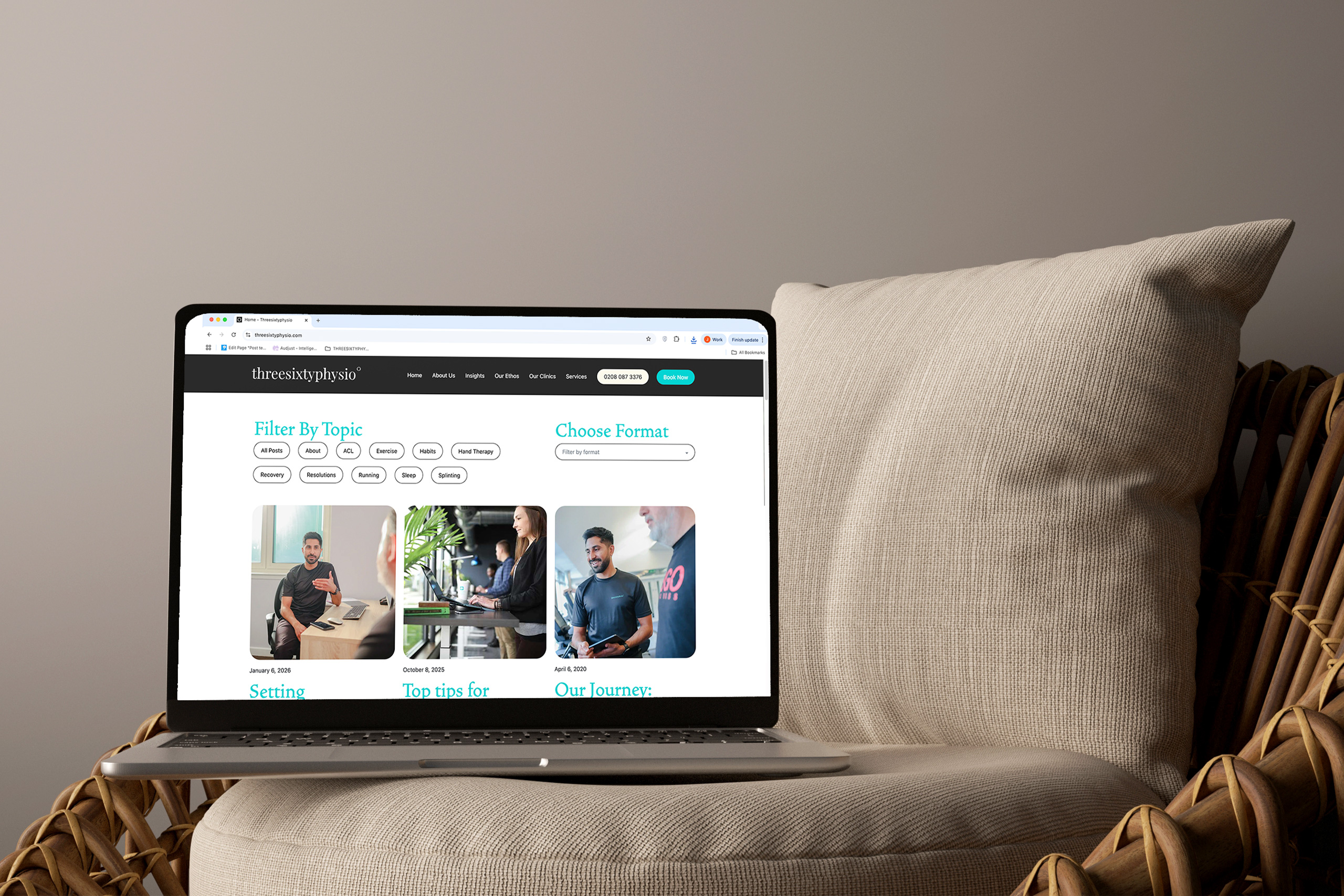
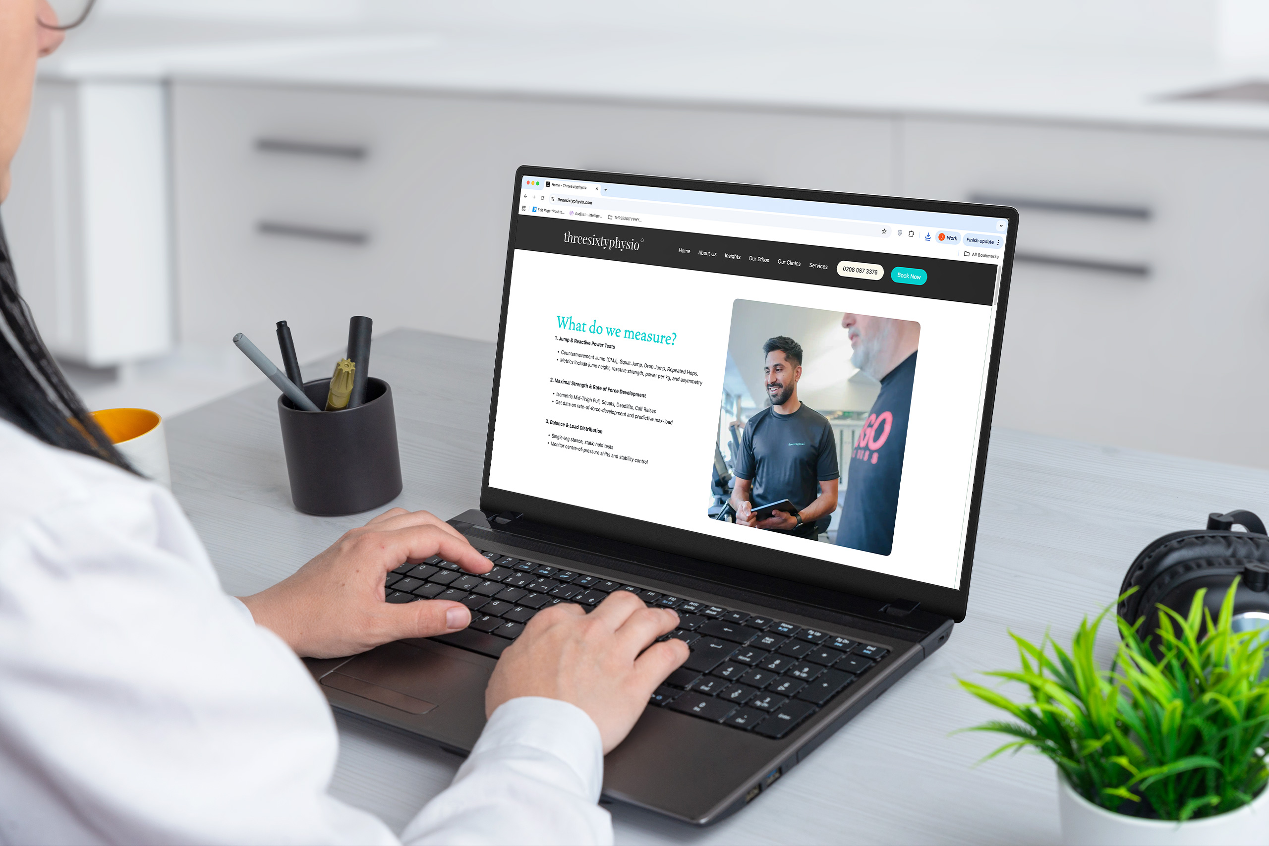
The Insights section was built to make content easy to navigate and genuinely useful. We introduced a flexible filtering system that allows users to quickly sort content by topic and format – Whether that’s articles, videos, podcasts, or more. It’s a simple interaction on the surface, but it makes a big difference in helping users find exactly what they’re looking for without digging around. As the content library grows, the structure is already there to support it – Keeping everything organised, accessible, and easy to explore.
On the Our Ethos page, we took a more immersive approach. As users scroll, each section naturally transitions into the next, with the layout guiding the pace. Background colours shift to clearly define each part, creating a sense of movement and progression down the page without it feeling forced or over-designed.
Tying it all together is the circular hero element, featuring a rotating stroke that works as a subtle progress indicator – Signalling when the next section is about to come into view. It’s a small but considered detail that not only adds to the experience, but also reinforces the 360 identity running throughout the brand.
A Warmer Edge to the Brand
To balance the boldness of the teal and black, we introduced a secondary colour – Drift Sand. It’s a soft, earthy tone that brings a bit of warmth into the palette without taking anything away from the strength of the core brand colours.
Used across backgrounds and key sections, Drift Sand helps break up the darker tones and gives the design more breathing room. It keeps everything feeling clean and considered, while adding just enough contrast to guide the user through the page.
It’s a subtle addition, but an important one. Paired with the teal and black, it creates a more rounded, confident visual identity. One that feels modern, approachable, and distinctly Three Sixty Physio.
The new website gives Three Sixty Physio a platform that properly reflects their brand and supports future growth – Making it easier for users to explore services, engage with content, and take action.
With a flexible structure and scalable content system in place, the site is built to evolve alongside the business.
Vinay Parmar
Founder and & MSK Physiotherapist
Three Sixty Physio
projects to check out
projects to check out
projects to check out
projects to check out
projects to check out

The Preparation Group
The Preparation Group
The Preparation Group
- Website
BlueSky Education
BlueSky Education
BlueSky Education
- Branding
- Large Format
- Website
Leaf Psychology
Leaf Psychology
Leaf Psychology
- Branding
Newton Fallowell
Newton Fallowell
Newton Fallowell
- Animation
- Campaigns
- Large Format